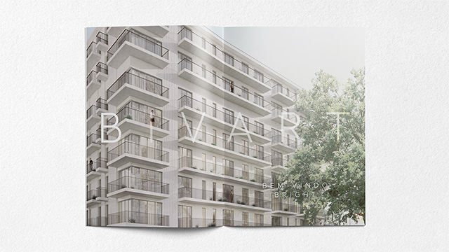
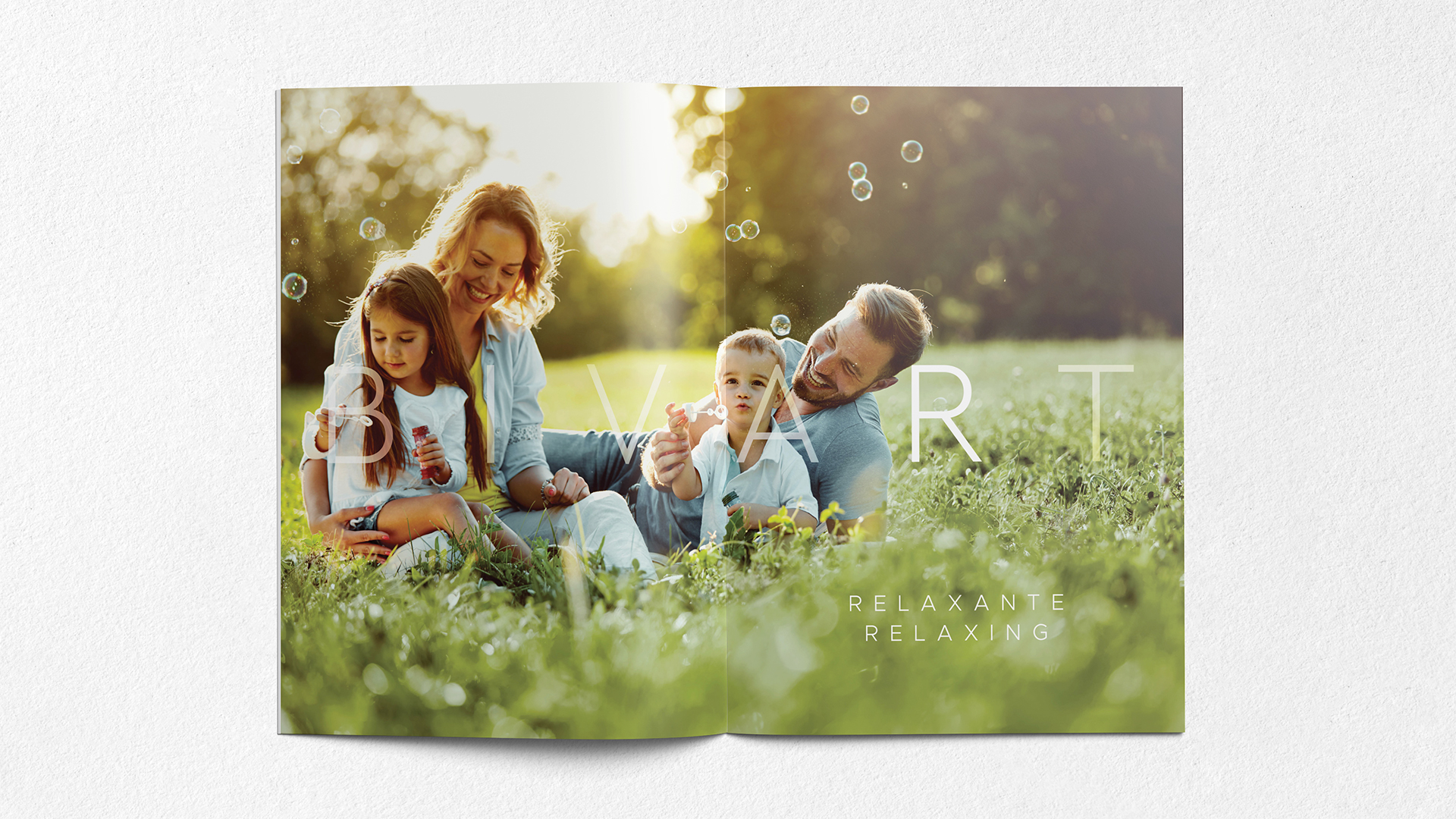
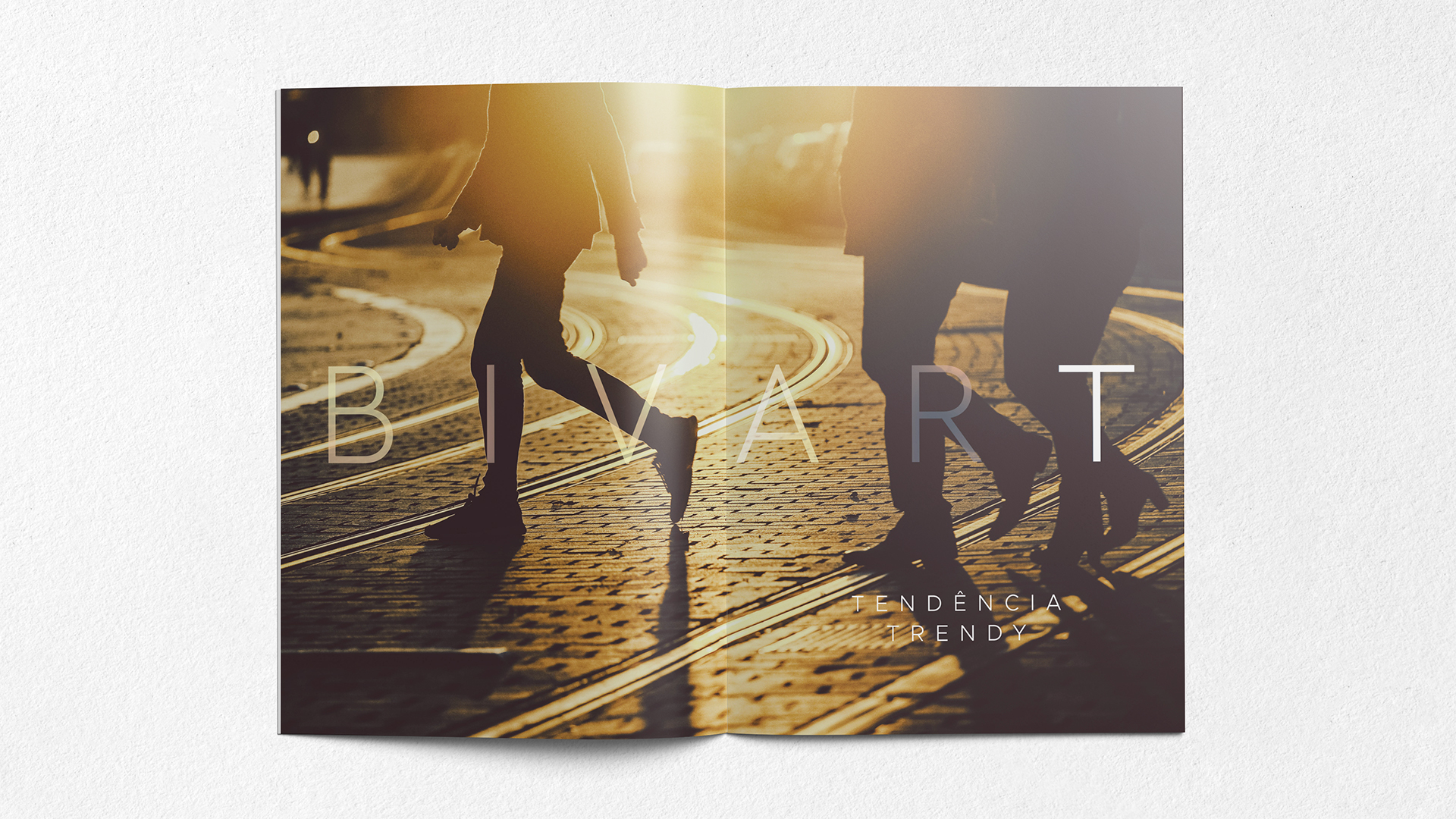
The Bivart Residences is a new vision of urban living. We look to create a young contemporary brand that reflects the dynamic and cosmopolitan nature of Lisbon with innovation and friendly wise among nature.
Naming - The goal was to create a unique and distinctive name, easily memorable and immediately associated with the location. The strategy was based on mixing the street name, “Avenida Luís Bivar”, with the promoter’s brand signature, “Creativity in the city - Art”, among the unique architectural vision of the building. Welcome to The Bivart.
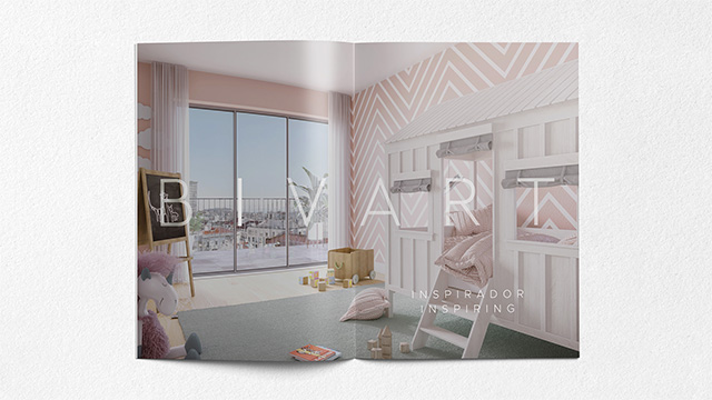
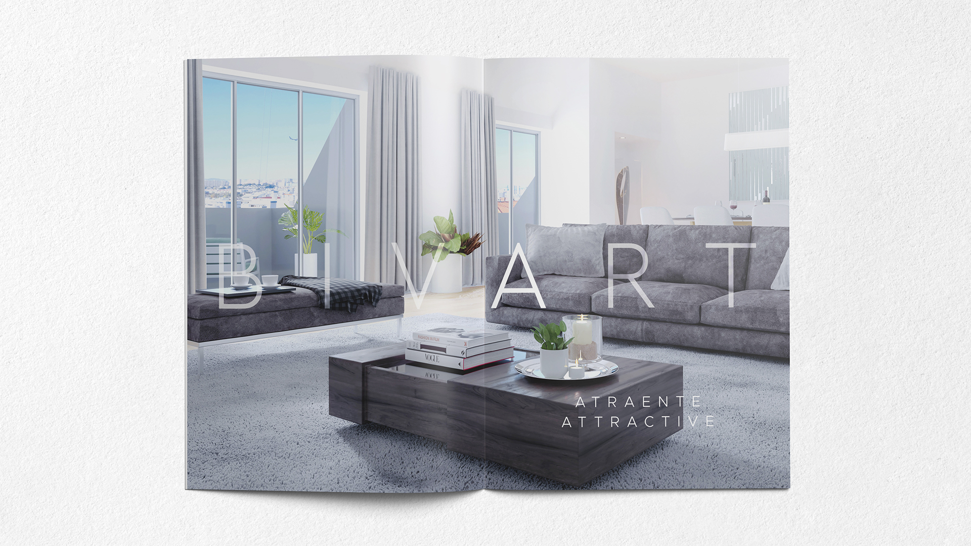
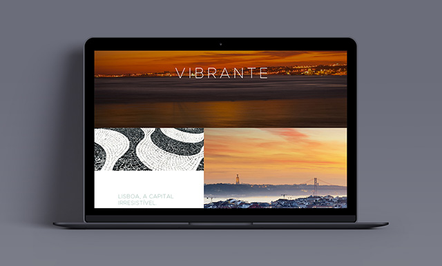
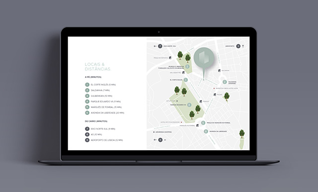
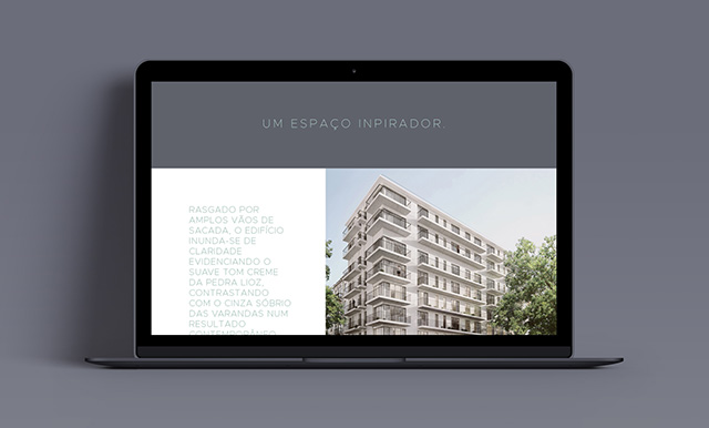
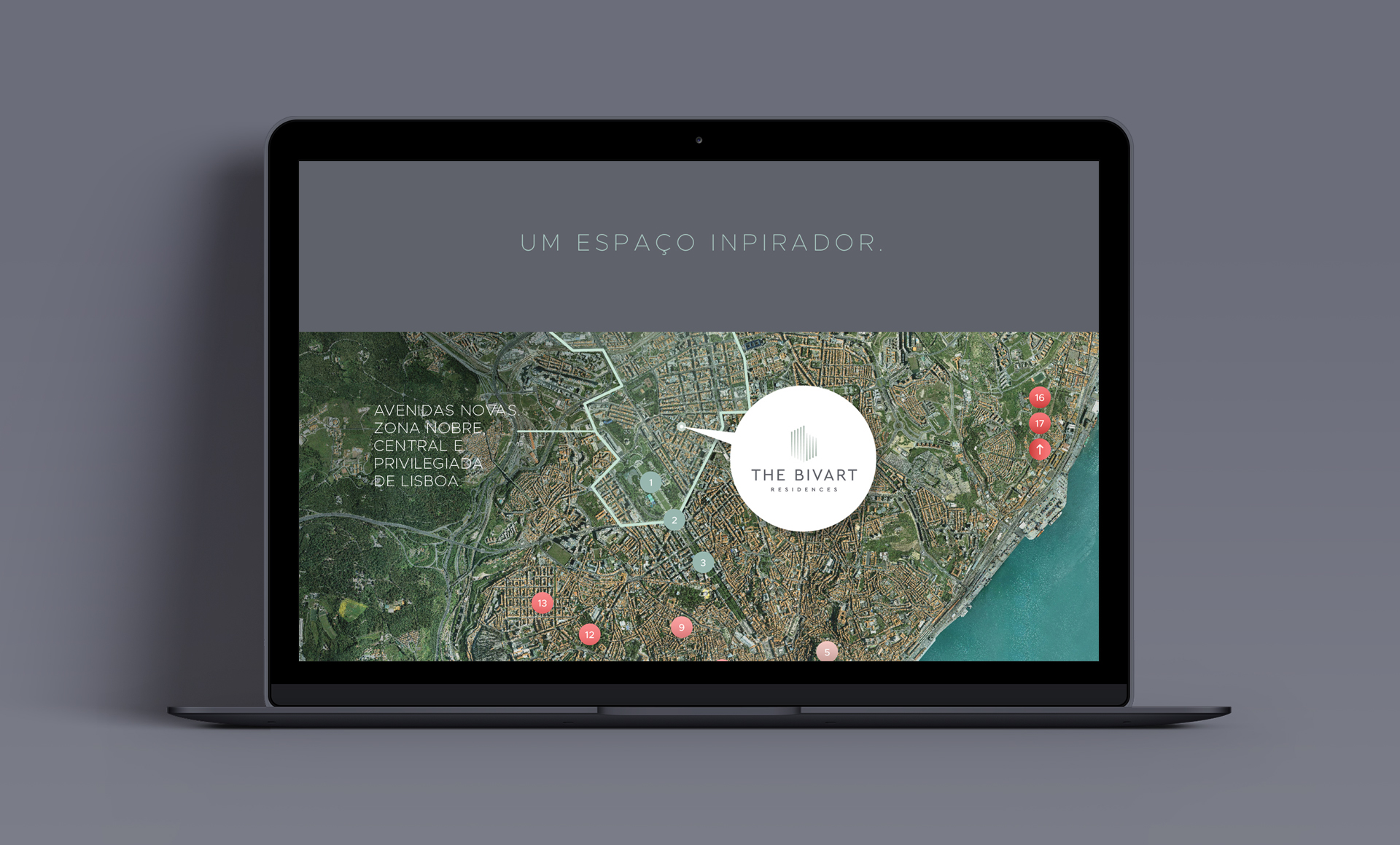
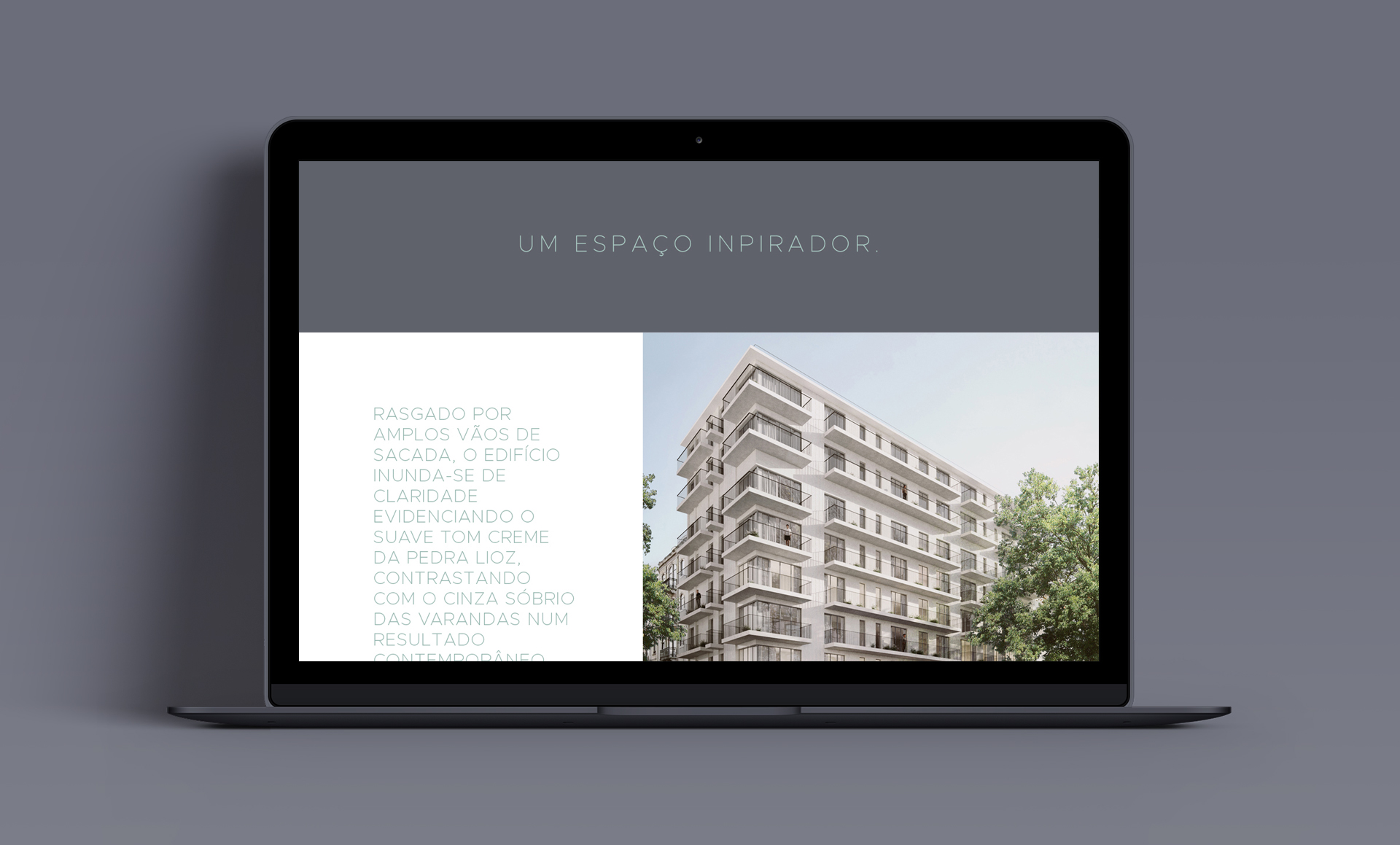
Statement - "An inspiring place to be" comes from the location and the building benefits, aesthetics and artistic features, green surroundings and walking distance.
Branding . Print & Editorial Design . Web Design – 2018


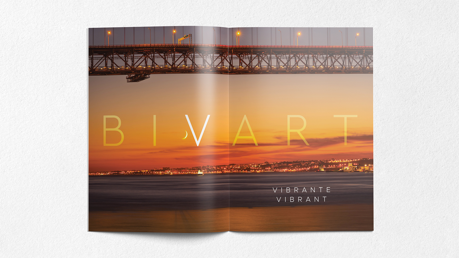
The logo was developed by understanding the architectural and aesthetic vertical features of the building and by adding a discreet letter B with the shape of the building corner without losing the identity. All the pattern was exclusively designed to enrich these criteria. The green colour is inspired in nature from the green landscape and surroundings and the grey by its strong character from the iron on the balconies.


Client: Promiris
Project: The Bivart - Residences
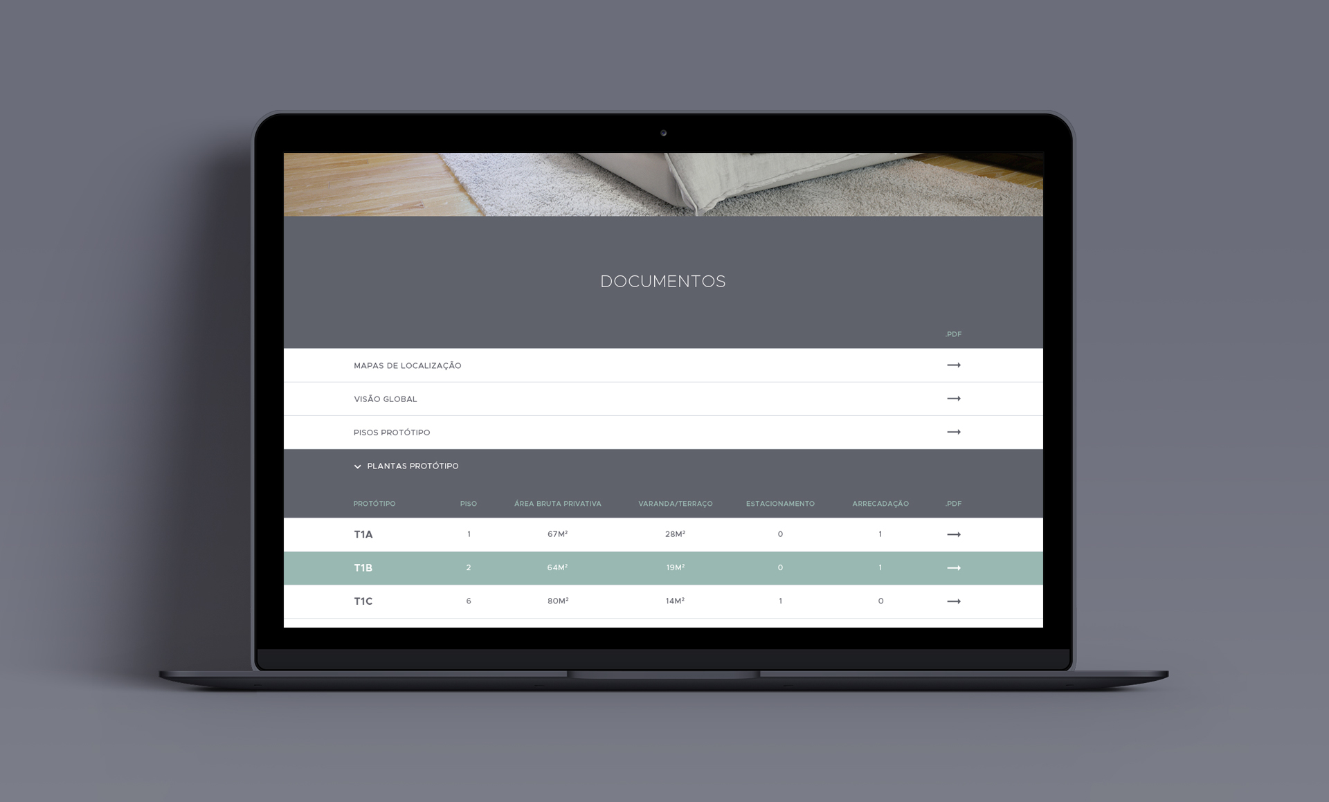
Category: Naming . Branding . Brochure . Floor Plans . WebDesign & Development
3D: @Onstudio